(This is a guest post from Wouter Rocchi, the co-founder of ChartBuddy, on what it's like to switch from PowerPoint to Google Slides)
I spent five years inside PowerPoint. Not casual "let me throw some slides together" use — the kind where you're formatting waterfall charts at midnight, aligning boxes by the pixel, and rebuilding someone's deck from scratch because "the story doesn't land." At Monitor Deloitte, PowerPoint wasn't a tool. It was muscle memory. It was how I thought.
Then I left to co-found Chartbuddy, a Google Slides add-on for professional chart types. Which meant I had to practice what I preach. No more PowerPoint. No more Windows either — I switched to Mac at the same time, because apparently I enjoy making life harder for myself.
The first few weeks were rough. Genuinely rough. And I say that as someone who was building a product for this ecosystem. This is what I learned — what broke, what surprised me, and the setup that eventually made me feel like a strategy consultant again.
{toc}
The file conversion is the easy part
Let's get the obvious question out of the way: how do you convert a PowerPoint to Google Slides? You upload the .pptx to Google Drive, right-click, open with Google Slides, done. Formatting holds up better than you'd expect. Some fonts swap, some animations disappear, but the bones survive.
That part is anticlimactic. The hard part is everything after.
What actually breaks is your speed
The moment I tried to build something in Google Slides from scratch, I felt slow. Not confused — slow. The kind of slow where you know exactly what you want to do and your hands don't know how to do it.
In PowerPoint, I had five years of muscle memory. Keyboard shortcuts I didn't even know I knew. Think-cell for every chart. The slide sorter for restructuring a storyline. Quick-align, quick-swap, resize-and-snap — all automatic, all fast.
On top of that, Monitor Deloitte had an incredible template library. Every slide type you could think of had already been built — on brand, properly formatted, ready to populate with your content. Between the firm's templates and my own "wall of fame" (a personal collection of the best slides I'd built or borrowed over the years), I almost never started from a blank slide. That's a massive time saver you don't appreciate until it's gone.
Google Slides has none of that out of the box. And the native keyboard shortcuts are different enough that your old muscle memory actively works against you. On top of that, I was learning a new operating system. Cmd instead of Ctrl. Different trackpad gestures. Different everything.
It felt like being a junior consultant again. I knew what good output looked like. I just couldn't get there fast.
A simple way to think about what you need to replace
After a few frustrating weeks, I started thinking about the gaps more systematically (old habits). They fell into three buckets:
Across-slides — How do I go from nothing to a full deck, or take a messy deck and make it cohesive? This covers both creating a first draft (0→1) and restyling an existing one (1→10).
In-slide: content — How do I build the charts, diagrams, and data visualizations that make individual slides actually communicate something?
In-slide: formatting — How do I get the micro-level speed back? Alignment, shortcuts, object manipulation, the stuff that makes slide-building feel fluid instead of clunky.
Once I had this in my head, it got easier to figure out what to look for — and what to ignore.
Across slides: this is where AI changed the game
In PowerPoint world, going from a blank deck to a working first draft was hours of manual work. You'd outline the story on paper, then build it slide by slide. Maybe Frankenstein something together from old decks and your template library. There was no real shortcut.
Plus AI basically replaced that entire workflow for me — and then some.
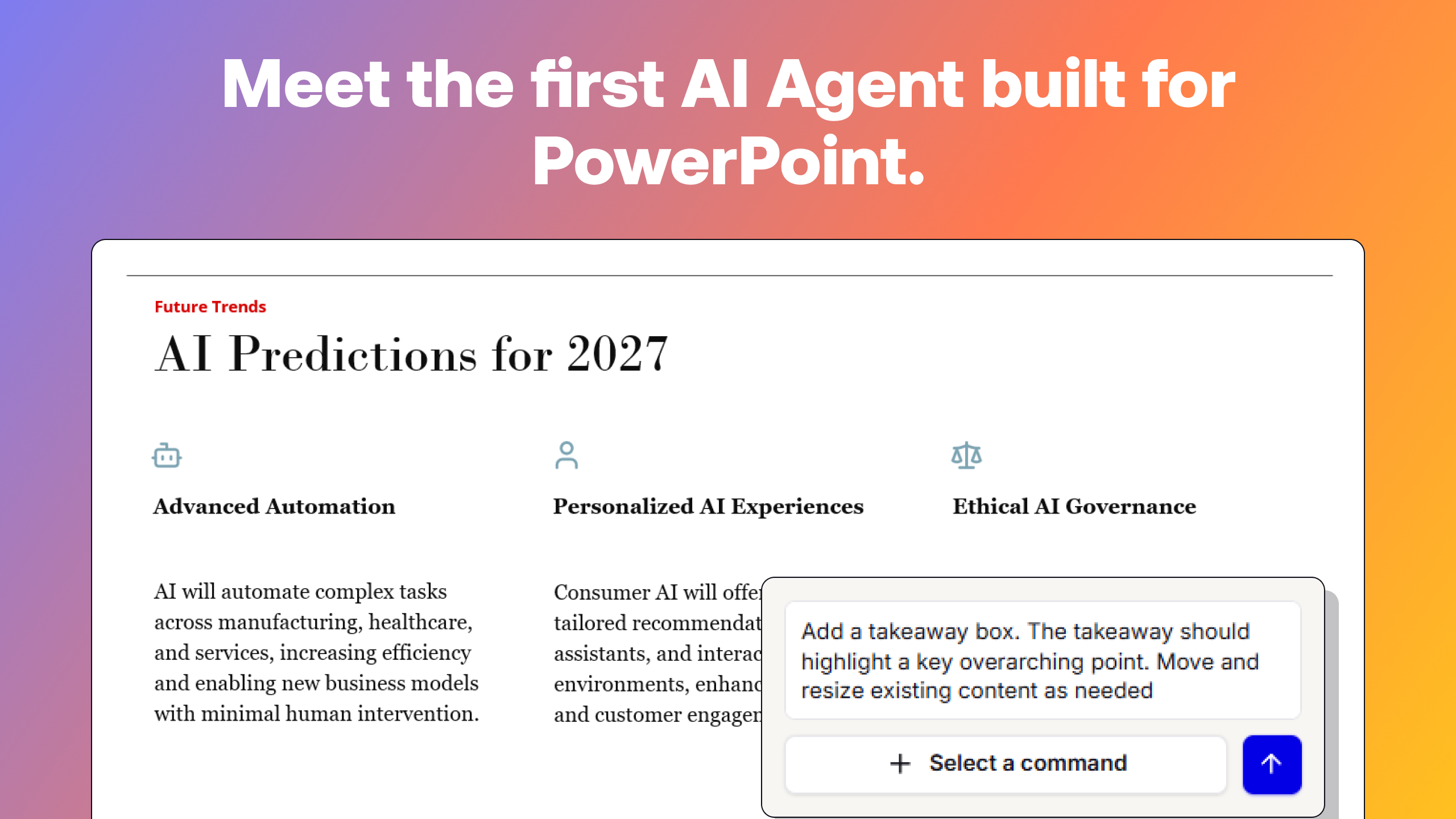
For deck creation, you give it a prompt, a document, a brief, or a set of notes, and it generates a full slide deck with a logical storyline. Not just bullet points on slides — an actual narrative structure. I was skeptical at first. I've seen enough "AI slide generators" that produce generic clip-art-level output. Plus AI is different because it thinks in storylines. The output isn't a final deliverable (nothing ever is), but it's the right kind of starting point: you're editing and tightening, not building from zero. What used to be an afternoon became ten minutes plus an hour of refinement.
For deck restyling, it's equally useful. You've got a working deck — maybe you built it, maybe someone handed it to you, maybe three different people contributed slides in three different styles (they always do). Plus AI's restyle feature applies a consistent look across the entire presentation — new color scheme, new fonts, new layout logic — without rebuilding each slide. In PowerPoint, this was a manual slog: slide by slide, reformatting, reapplying the master, fixing the rogue slide that looks like it came from 2014. Plus AI handles it at the deck level.
Whether you're going from 0→1 or from 1→10, Plus AI owns the across-slides problem. It's the single biggest productivity gain I've found in the Google Slides ecosystem.
In-slide content: charts, diagrams, and the control problem
Now the chart problem. If you've used think-cell in PowerPoint, you know what I mean. Professional chart types, formatted in seconds. Every detail under your control — data labels, annotations, color coding — all with a few clicks.
Google Slides can embed charts from Google Sheets, and for basic stuff that works fine. If you need a simple bar graph, a line graph showing a trend, a pie chart — native Google Sheets charting gets you there. The bar chart maker is intuitive. The line graph maker does what you'd expect. You select your data, hit Insert → Chart, and pick your type. For the standard types of charts and graphs, it's genuinely good.
But there are two problems. First, the chart types: Google Sheets doesn't do waterfalls. It doesn't do mekkos. It doesn't do proper stacked bars with totals, or bubble charts with the level of control you'd want.
Second — and this is the one that drove me crazy — even for the chart types Google Sheets does support, you don't have real control. Want to remove the tick marks? Add a CAGR annotation? Break an axis? Place a perfect legend? Adjust one specific data label without moving everything else? Good luck. You're fighting the tool instead of using it.
That's exactly why we built Chartbuddy. It's not just about adding chart types that Google Sheets doesn't offer natively — waterfalls, marimekko, stacked and clustered bars, bubble charts. It's about giving you control over every detail. Colors, axis breaks, annotations, CAGR lines, legend placement, tick marks or no tick marks — you name it, you can adjust it. Intuitively, smoothly, quickly. If you've ever relied on think-cell in PowerPoint, that level of granular control is what you actually miss. That's what Chartbuddy brings to Google Slides. (And yes, I'm biased. But I built it precisely because the gap was real and I was living it every day.)
For diagrams — process maps, org charts, decision trees, the kind of visual logic that shows up in every strategy project — Lucidchart plugs directly into Google Slides. You build the diagram in Lucidchart and embed it in your deck. For structured diagrams with multiple layers and connections, it's genuinely fast.
In-slide formatting: the gap I still haven't closed
This is the honest part. Five years of PowerPoint muscle memory and I still haven't found a proper replacement for the slide-level formatting speed.
The small, fast operations that PowerPoint power users take for granted: quick-align a set of objects to a reference point, swap two elements, match the size of one shape to another, apply consistent spacing in one keystroke. Google Slides can technically do most of these things (Arrange → Align, distribute horizontally, snap to guides), but it takes three clicks and a menu dive where PowerPoint took one shortcut.
I've tried add-ons that promise to fix this, but none of them really nail it. The problem is fundamental: they still require you to open a sidebar, scroll through a menu, wait for it to load, and then click. That's not a shortcut — that's just a different set of clicks. What PowerPoint power users miss isn't a feature buried in a menu. It's the speed of a keystroke.
What I really want is something like our Plus AI's custom PowerPoint macros, but for Google Slides. A layer that adds smart shortcuts, one-click alignment, and object swapping right into the toolbar. If someone builds that for the Google ecosystem, I will genuinely be their first customer. (If you're working on this: email me.)
Where I ended up
Here's my current stack, and what I'd recommend to anyone making the same switch:
Plus AI — For deck creation and restyling. Any time I need to go from blank to first draft, or make an assembled deck look cohesive. Owns the across-slides problem entirely.
Chartbuddy — For professional charts with full control. Waterfalls, mekkos, bubble charts, and the granular formatting that Google Sheets doesn't give you. The think-cell replacement.
Lucidchart — For diagrams, process flows, and structured visuals. Embeds directly into your deck.
??? — For slide-level formatting and productivity shortcuts. Still looking.
Would I go back?
No. But I want to be honest about why — it's not because Google Slides is clearly better than PowerPoint across the board. It's not. PowerPoint with think-cell, macros, and a strong template library is an incredibly productive setup.
The reason I wouldn't go back is that my work changed. I'm building a company now, not delivering client decks five nights a week. I build fewer presentations, and the ones I do build need to come together fast — which is where Plus AI and Chartbuddy earn their keep. For my current workflow, Google Slides plus the right add-ons is the better fit.
If you're making the switch — or being forced into it — here's my honest advice: don't try to replicate your PowerPoint workflow one-to-one inside Google Slides. That'll make you miserable. Instead, figure out what you actually need, find the right tools for each bucket, and give yourself a few weeks to build new habits. The shortcuts you'll miss are real. But the gaps are smaller than they feel in week one, and they're getting smaller every year.